Workhaus Collective
I designed and illustrated these posters for the Minneapolis theater group, Workhaus Collective, who write and produce new plays.
I would typically work with the playwright, first getting an idea of their vision for the poster. The poster is the first impression the public has of a new play; the image and typeface are a distillation of the play's themes. Often I would read parts of the script suggested by the playwright, but sometimes I was given just a few abstract ideas or phrases to kickstart my design.
I would send the playwright sketches, and we would decide on the right direction for the design. Elements are continually tweaked, names are added, and dates are changed. Eventually the design became mine alone, and the final result was a marriage of two artists' visions.Due to the budget restrictions of this non-profit group, the posters were often black-and-white so that they could be printed without great expense.
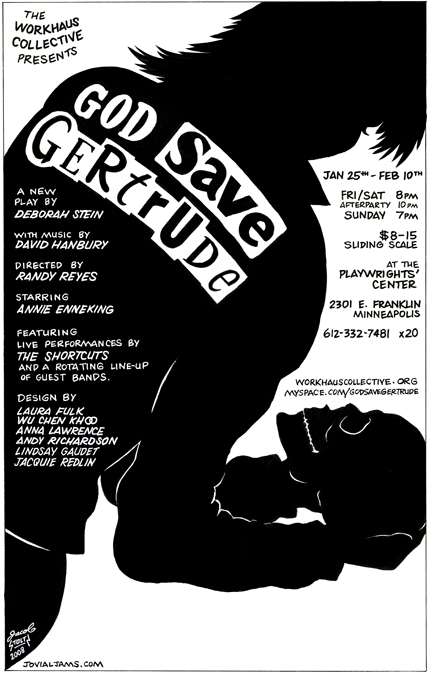
God Save Gertrude, 2008
This was my first poster for Workhaus, and still my favorite. I think it captures the essence of the play with elegance and bold simplicity. God Save Gertrude was both a play and a concert, a punk-rock Hamlet.
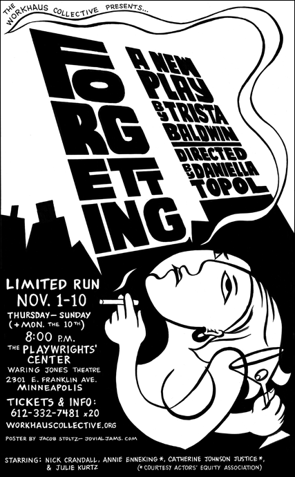
Forgetting, 2009
My assignment: Cubism meets Matisse-brush-strokes meets East Village, tits-out, drunk-tilt, up-all-night, just got laid, it wasn't so great kind of something... The words as twin towers was my idea, adding a little Russian Constructivist element.
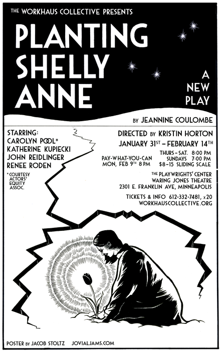
Planting Shelly Anne, 2009
The central image is a dream sequence in the play. The Art Deco font just seemed to fit, and the title I did by hand. The rest of the type is digital, but kerned manually. The model was my wife, Eleanor.
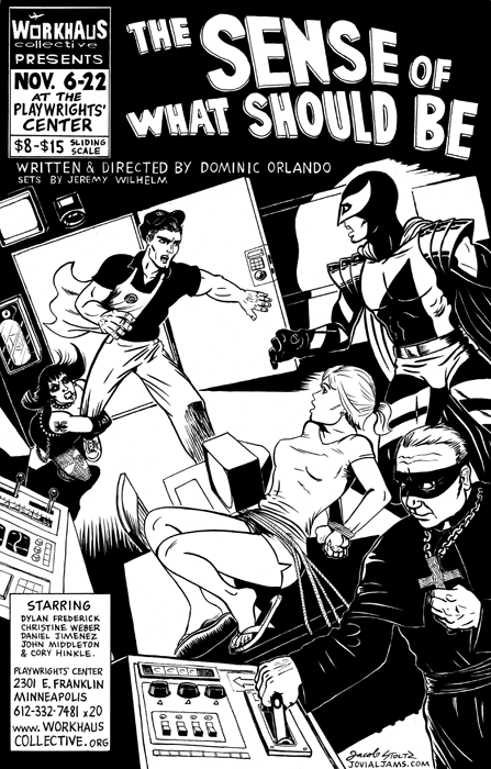
The Sense of What Should Be, 2009
Here I really got to put my strengths to use. The play was like a comic book, with costumed villains, and the author wanted the poster to look the part. I summoned all my powers of dynamic black-and-white contrast, and channeled my inner Jack Kirby for the barista-hero.
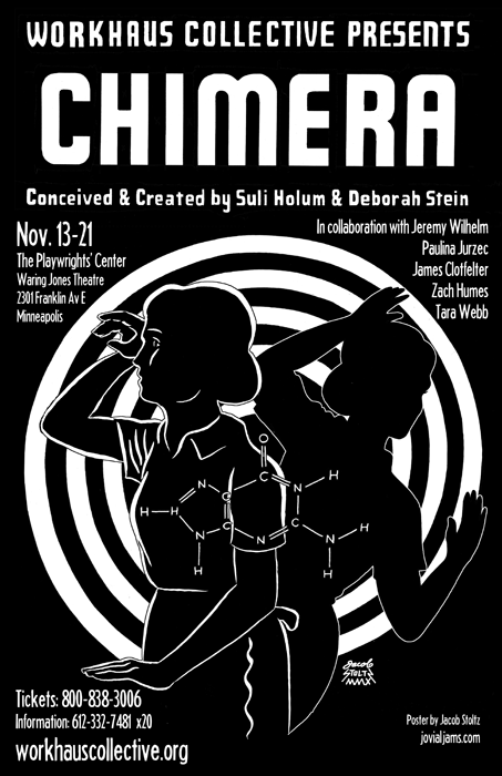
Chimera, 2010
A play about a housewife with two sets of DNA. The spiral is a Twilight Zone reference, and I thought a DNA double helix would be too much vertigo, so I went with an amino acid molecule instead. I decided on the typeface of the title based on the shapes of the letters, and its mid-20th Century feel fits with the other elements. The top three lines on the poster are hand-lettered.
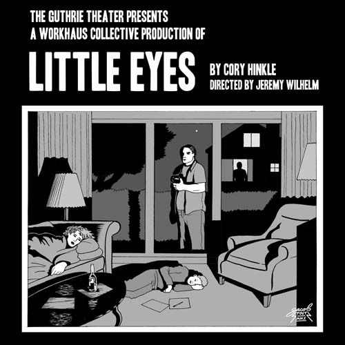
Little Eyes, 2010
I've got a thing for white text on black because it can be read more easily from a distance. This was my first foray into digital color for Workhaus, since the Guthrie was footing the postcard printing bill, but I like the grayscale version better. I was pretty much told exactly what to draw for this one.
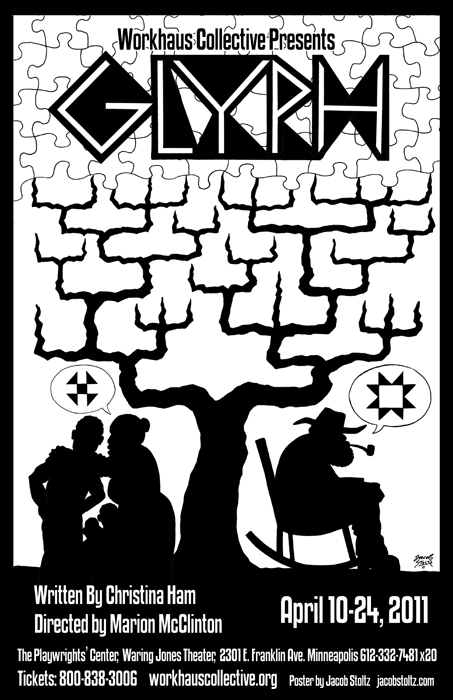
Glyph, 2011
This was a true collaboration. The playwright shared with me the play's inspirations: her African-American family tree, the puzzle of identity, the idea of a glyph, and extinct slave dialects. I just happened to have been reading something my wife showed me about slaves sewing symbols into their quilts that relayed messages. One of our common inspirations was Kara Walker's silhouettes, and it all meshed together perfectly.
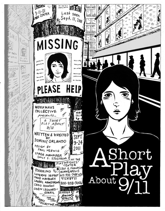
A Short Play About 9/11, 2011
Unlike most of those missing in Manhattan after 9/11/01, this girl just has amnesia.
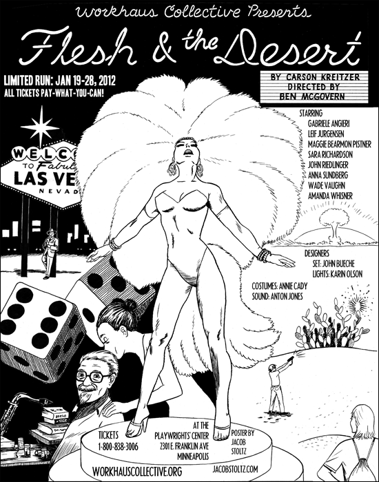
Flesh and the Desert, 2012
In this collaboration, the playwright had several specific elements in mind, and my job was to illustrate them and piece them together. The dice were my idea. The neon-tube and marquee lettering were hand done, and the rest digital.
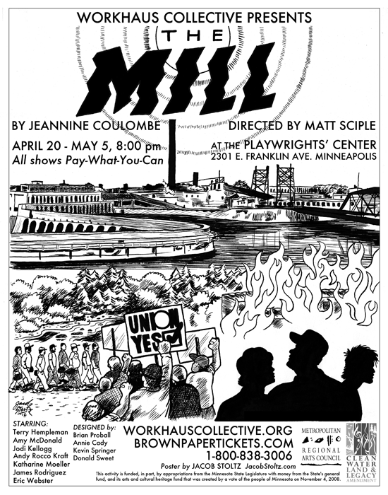
The Mill, 2012
A piece based on the 1989 Boise Cascade paper mill union riot in International Falls, MN. Since tensions break out more often in hot weather, I wanted the title and sun to look sweltering.
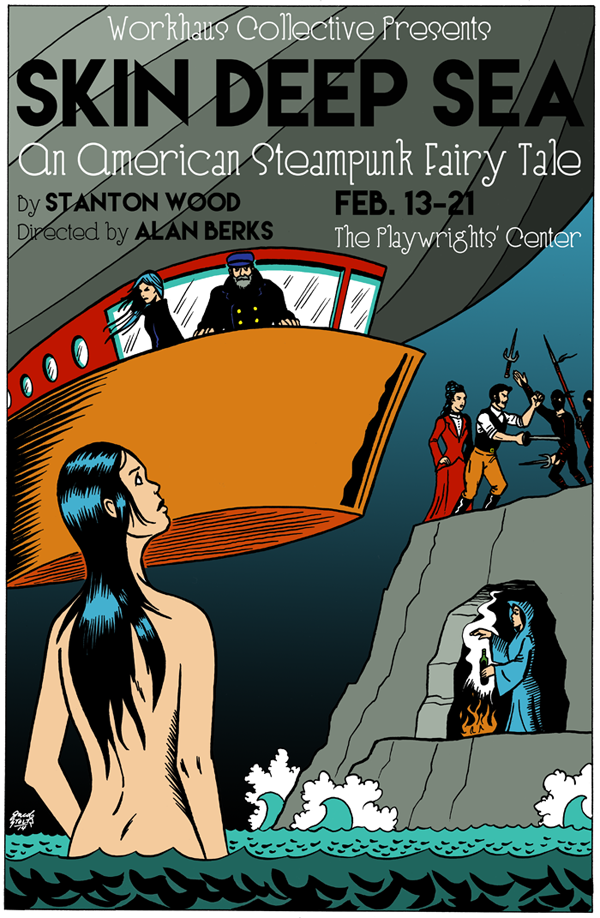
Skin Deep Sea, 2014
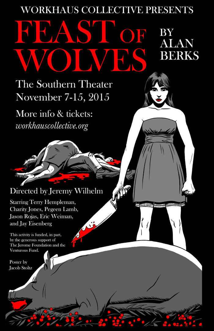
Feast of Wolves, 2015
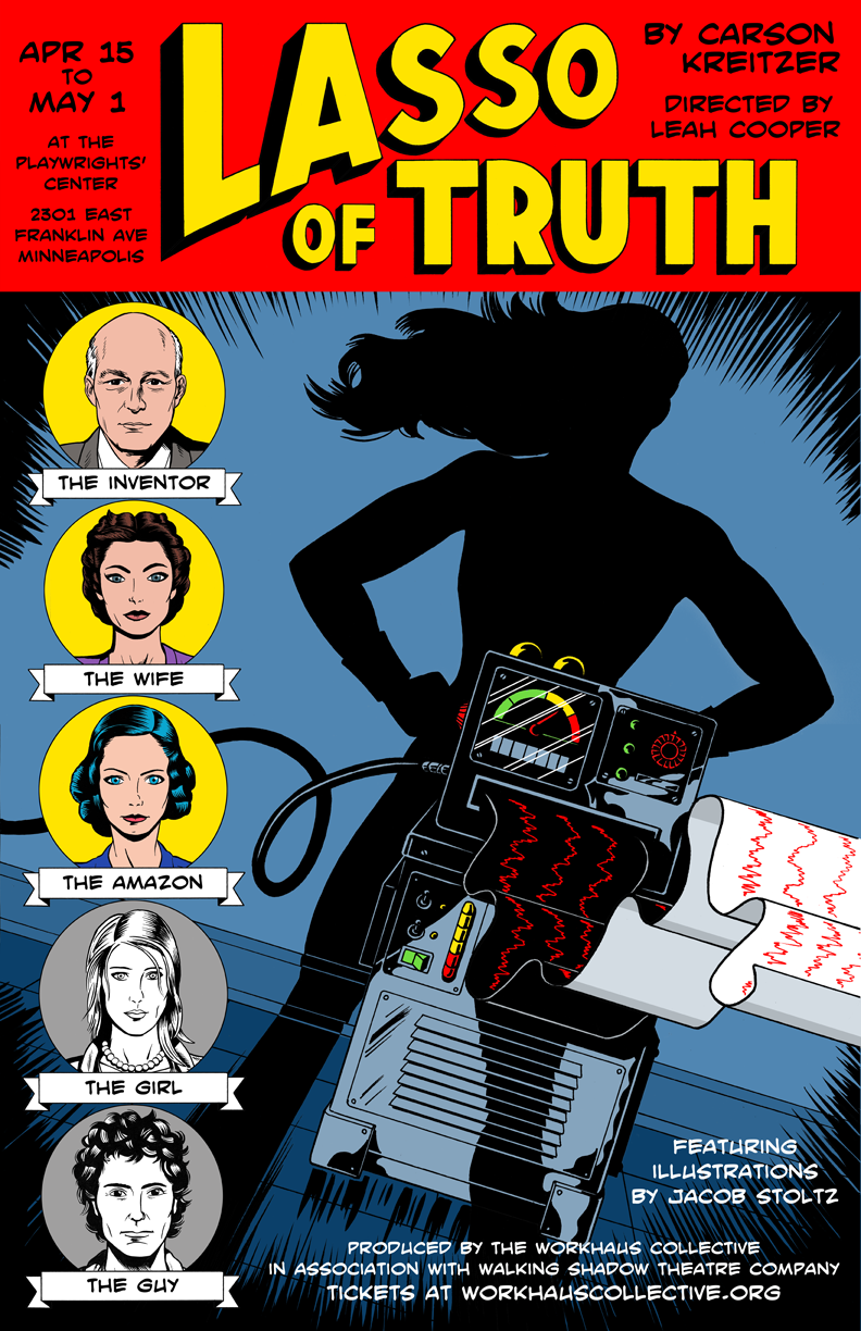
Lasso of Truth, poster from Minneapolis production, 2016
See my Lasso of Truth page for more info and samples of my 100+ illustrations used as projections in the production.
 Workhaus Collective
(13 designs) Collaborations with Josh Journey-Heinz
 Stoltz Flyer
 End of the Year Party
 Origin Story
 ACE Flyer
 World Peace & Prayer Day
 Aby Wolf
 It's Called a Mind
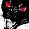 Clipd Beaks at the Kitty Cat Klub
 Clipd Beaks
at Big V's